contact@isaacferguson.studio

Recess Hospitality Group

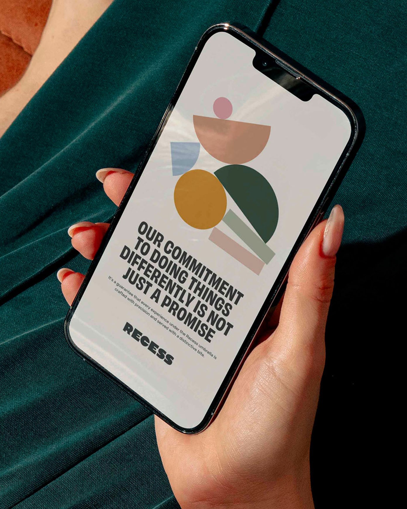
Recess is the parent brand behind a growing collection of design-led hospitality spaces. The identity needed to feel vibrant and confident, while still leaving room for each venue to express its own personality. Anchored by a custom wordmark built from rounded, geometric letterforms, the system is intentionally simple and flexible, supported by a suite of secondary shapes used across the wider brand.

Drawing from the established colour palettes of the group’s existing venues, the identity feels familiar yet adaptable, allowing new expressions to emerge as the group grows. The result is a parent brand that brings everything together without overshadowing the spaces beneath it.

I acknowledge and pay respect to the Wurundjeri people, the Traditional Custodians of the land I live and work on. Always was, always will be.

By Isaac Ferguson

© 2026

Feel free to reach out on LinkedIn or send me an email.
I’m looking forward to hearing from you.

contact@isaacferguson.studio

Recess Hospitality Group

Recess is the parent brand behind a growing collection of design-led hospitality spaces. The identity needed to feel vibrant and confident, while still leaving room for each venue to express its own personality. Anchored by a custom wordmark built from rounded, geometric letterforms, the system is intentionally simple and flexible, supported by a suite of secondary shapes used across the wider brand.

Drawing from the established colour palettes of the group’s existing venues, the identity feels familiar yet adaptable, allowing new expressions to emerge as the group grows. The result is a parent brand that brings everything together without overshadowing the spaces beneath it.

I acknowledge and pay respect to the Wurundjeri people, the Traditional Custodians of the land I live and work on. Always was, always will be.

By Isaac Ferguson

© 2026

contact@isaacferguson.studio

Recess Hospitality Group


Recess is the parent brand behind a growing collection of design-led hospitality spaces. The identity needed to feel vibrant and confident, while still leaving room for each venue to express its own personality. Anchored by a custom wordmark built from rounded, geometric letterforms, the system is intentionally simple and flexible, supported by a suite of secondary shapes used across the wider brand.

Drawing from the established colour palettes of the group’s existing venues, the identity feels familiar yet adaptable, allowing new expressions to emerge as the group grows. The result is a parent brand that brings everything together without overshadowing the spaces beneath it.

By Isaac Ferguson

© 2026