Recess Hospitality Group
Introduction
Recess is the parent company behind a growing group of design-led hospitality venues across regional NSW, two of which I had already branded: The Royal Hotel and Birdy Bar. Its identity needed to feel vibrant and confident while leaving room for each venue to keep its own personality.
Client
Recess Hospitality Group, regional NSW
Type
Independent commercial project
My role
Parent brand identity and tone of voice
My deliverables
Wordmark, graphic devices, colour, typography, motion direction, stationery, social media templates, brand guidelines, tone of voice
Wider project
Venue brands for The Royal Hotel and Birdy Bar also by me; a third venue branded separately




Process and outcome
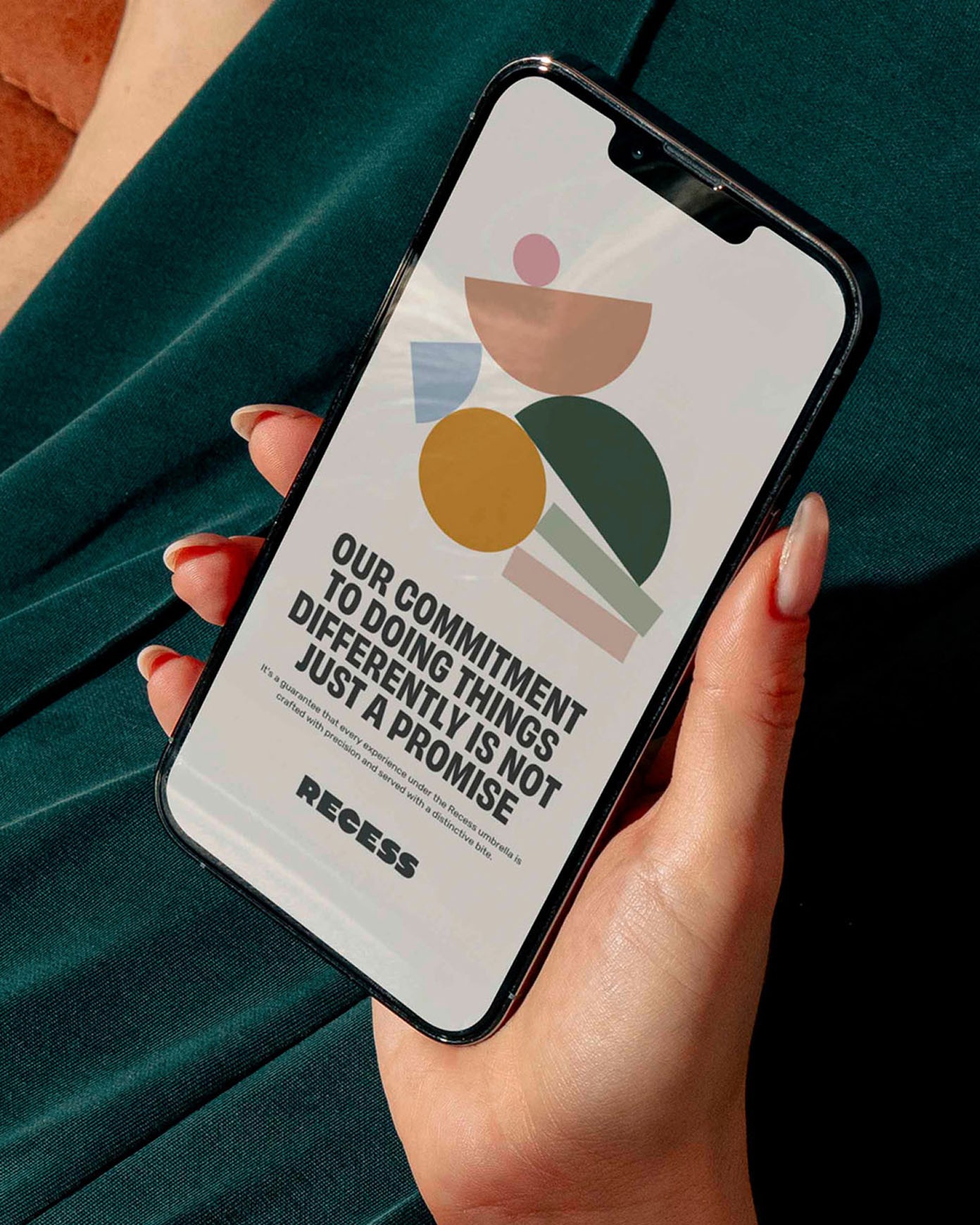
By 2023, the group had three venues and needed an identity to formally sit above them. Working from the name and a single visual reference for chunky type, I anchored the brand in a wordmark built from rounded, geometric letterforms, supported by a suite of secondary shapes. Rather than introduce a new palette, I drew on the colours of the group's existing venues, so the identity could grow by taking on the colours of each new venue as it joined. I also refined the tone of voice and key phrases in the brand guide, many of which were used at launch and beyond.
I presented a single concept, which the founder approved straight away. As a corporate-facing identity, it's used across stationery, corporate documents and the group's LinkedIn presence, and each venue credits Recess as its parent. I also set the motion direction through animated examples showing how the brand could move on screen, along with a set of social templates.
More projects


Feel free to reach out on LinkedIn or send me an email. I’m looking forward to hearing from you.
I acknowledge and pay respect to the Wurundjeri people, the Traditional Custodians of the land I live and work on. Always was, always will be.